
What Every Wedding Business Website Needs on Its Homepage (and What to Leave Out)
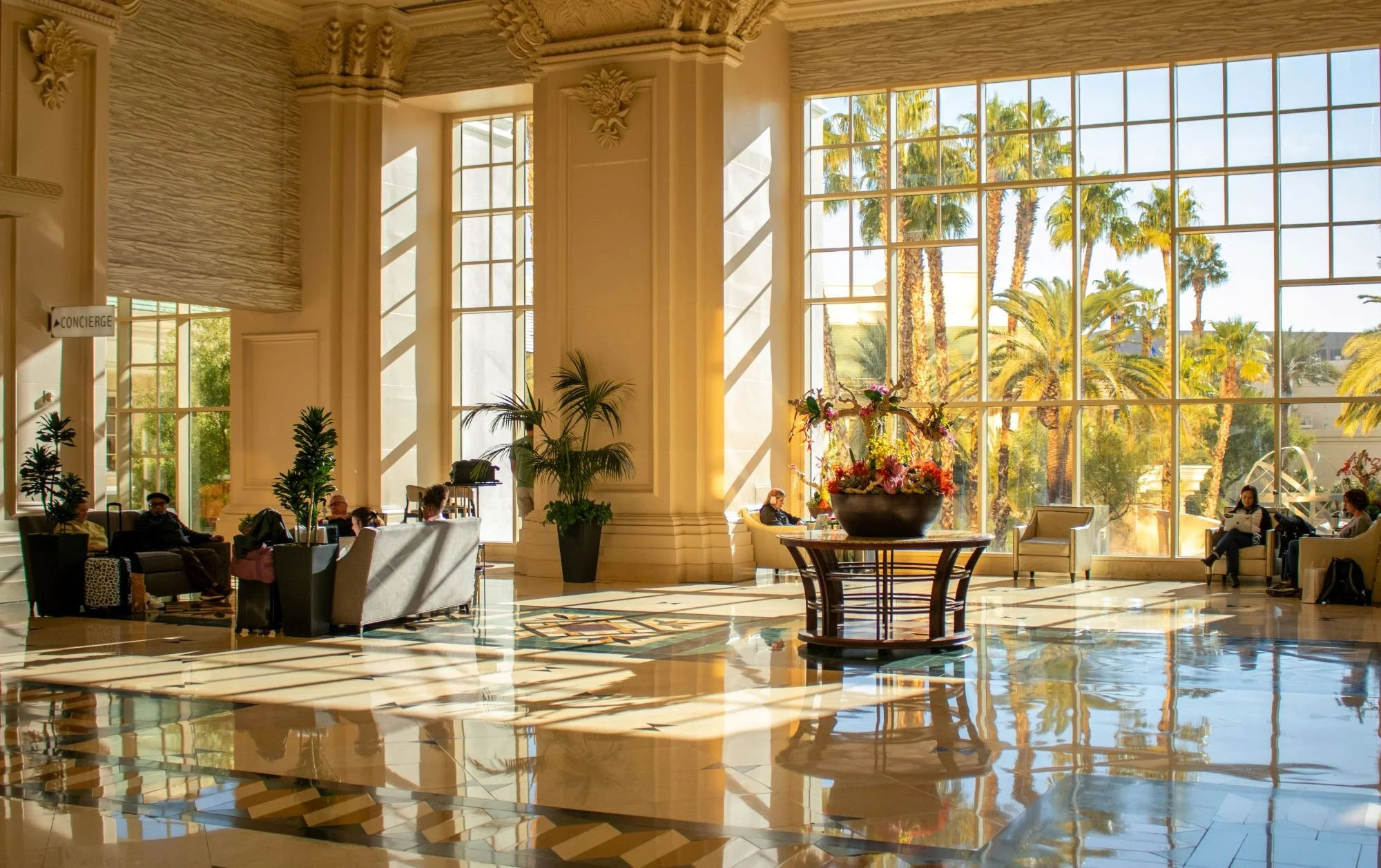
Imagine walking into the grand lobby of a beautiful hotel. You take one step inside and immediately get a sense of the atmosphere. The lighting, the layout, and the way the staff looks up and acknowledges you. Without anyone saying a word, you know whether you feel welcome. You also know exactly where to go next. Reception is to your left. The bar is just beyond the staircase. The elevators are tucked neatly at the back. The lobby sets the tone, but it also directs the entire experience.
Your website’s homepage is the lobby of your business. Couples arrive there first, and within a few seconds, they form an impression that’s surprisingly powerful. Research shows that users form judgments about a website in less than a second, and they spend more than half their viewing time on the content displayed above the fold, which is the part of the screen visible without scrolling.
That means your homepage has a simple, critical job. It needs to create a feeling of warmth and professionalism, but it must also function the way a hotel lobby does. It must guide each visitor to exactly where they need to go next. And because every couple explores a website differently, the homepage needs to support all of those paths gracefully.
Some couples will head straight to your Services page because they already know what they want. Others will click About because connection matters more than logistics. Some will head to your Portfolio to decide if your style resonates, while others will scan for testimonials or pricing. Your homepage doesn’t need to answer every question, but it must make it incredibly easy for visitors to navigate toward the answers they’re looking for.
The Power of Above the Fold
Above the fold is the most important part of your entire website. It’s the lobby chandelier, the scent in the air, the first few seconds when a couple decides if they’re staying or bouncing. Studies show that as attention moves below the fold, engagement drops sharply. This makes your top section the single strongest predictor of whether someone continues exploring or leaves altogether.
This space must be clear, confident and emotionally aligned. It should contain a headline that explains what you do and who you do it for, a subheading that adds a layer of meaning or specificity, and an image that instantly signals that the visitor is in the right place. If your homepage photography shows the kind of couples you want to work with, the ones reading your site will feel a sense of recognition. They need to see themselves reflected before they can imagine hiring you.
Just below that, or woven into the layout, belongs a short introduction. Not a full biography, simply a warm, human preview of who you are and the experience you offer. Couples make decisions emotionally before they make them logically. A sentence or two that feels like a genuine welcome goes a long way in establishing a connection.

Clarity First, Then Emotion
A homepage works best when it delivers clarity quickly. Couples want to know what you offer, who you serve and whether your approach aligns with what they’re looking for. The homepage should give them a snapshot of your services without diving into every detail. Think of it as signage in the lobby. You’re showing the way to the bar, not handing them the entire cocktail list.
Your visuals should do the same. A curated preview of your best work can help couples understand your aesthetic instantly. This isn’t the place for an exhaustive gallery. Show just enough to establish style and confidence. A small selection often feels far more intentional and far more professional than an overflowing display of images.
Social proof deserves a place on the homepage too, as long as it’s kept elegant and minimal. One or two heartfelt testimonials, carefully chosen for tone and specificity, can build trust without overwhelming. Australian research shows that customer reviews influence decision-making significantly, with more than ninety percent of consumers checking them before making a purchase decision.
This kind of trust-building is subtle, but it matters.
The Homepage as a Guide, Not a Catalogue
The temptation for many wedding vendors is to put too much on the homepage. They want to explain their process, tell their full story, showcase every gallery and introduce every package. But a homepage is not the entire hotel. It is the entrance. It should never feel overwhelming.
Too much information creates cognitive overload, which is one of the fastest ways to increase bounce rates. When visitors feel lost or confused, they leave.
Instead of trying to answer every possible question, your homepage should serve as a graceful guide. It leads visitors to the pages that exist to give them depth. The About page is where you can tell your full story. Services is where you explain your process. Your Portfolio is where you show range and quality. The homepage simply invites them into each of these experiences with confidence and ease.
What to Leave Out
Just as a hotel lobby doesn’t display every room, your homepage shouldn’t attempt to include everything either. Long autobiographical essays belong elsewhere. Overly detailed process explanations can be disorienting and unnecessary. Avoid cluttered galleries, auto-playing media or distracting widgets that slow down the experience. And perhaps most importantly, avoid generic wedding-industry clichés that sound like they could belong to anyone. Your homepage should feel unmistakably yours.
Simplicity isn’t just aesthetic. It’s strategic. A clean homepage feels like a safe, elegant space where couples can settle in and explore without having to work for it.

Flow That Feels Like a Real Conversation
When structured well, a homepage mimics the pace and grace of a natural interaction. You offer a warm greeting. You share a little about who you are. You help the visitor get oriented. You show them what you can do. You offer proof that you’re trustworthy. And then you invite them to take the next step.
This final invitation is the call to action, and it should feel like a gentle welcome rather than a demand. A CTA like “Check your date” or “Start your enquiry” lowers the emotional barrier and encourages visitors to take that next step without hesitation. Small shifts in CTA language can meaningfully influence user behaviour, especially when the tone feels aligned with the rest of the experience.
This is the moment where emotion and strategy intersect beautifully.
Conclusion
Your homepage doesn’t need to shout. It needs to guide. It needs to welcome. It needs to make couples feel that they have arrived in the right place. When you treat your homepage like the grand lobby of your business, you give every visitor the clarity they crave and the emotional resonance that helps them decide to stay.
When clarity and romance meet on the homepage, everything else clicks into place.