
What to Put on a Wedding Services Page (And What to Leave Out)
Why the most effective Services pages feel less like a price list and more like a luxury boutique experience.

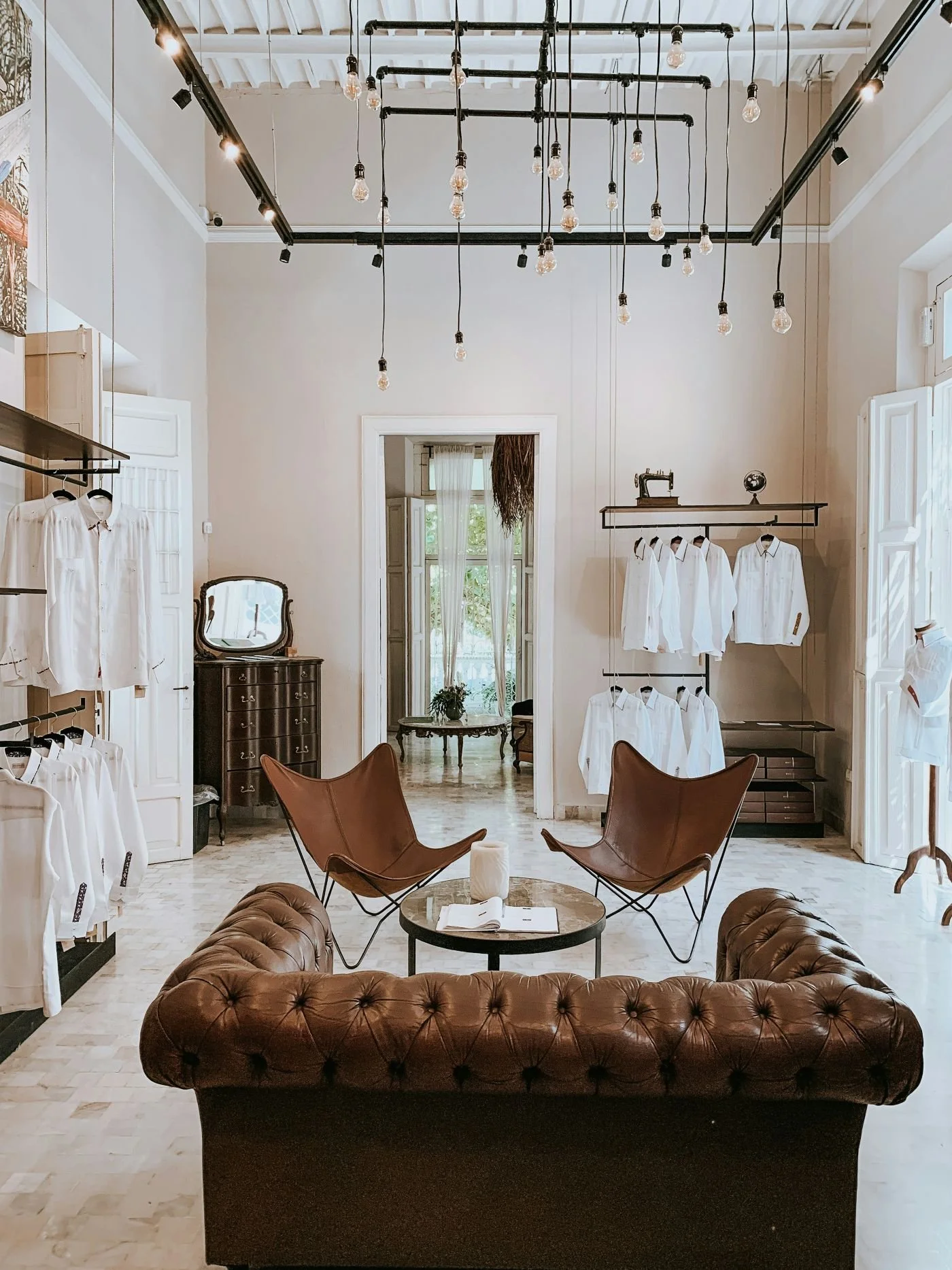
Picture this.
You walk into a beautiful high-end boutique on a quiet weekday morning. There’s space to breathe. Nothing is shouting at you. The lighting is soft, the layout intentional. A staff member looks up, smiles, and lets you orient yourself before offering help. Within seconds, you know exactly what kind of place this is, whether it’s for you, and what sort of experience you can expect if you stay.
No one hands you a laminated list of prices.
No one explains the stitching process before you’ve even touched the fabric.
And yet, somehow, you already trust the place.
That feeling—calm, clarity, confidence—is exactly what your wedding Services page should create.
And yet, for many wedding vendors, the Services page is where things unravel. It becomes crowded. Over-explained. Defensive. Or worse, generic. Instead of guiding couples toward a confident yes, it overwhelms them, confuses them, or asks them to work too hard to understand whether they belong there.
This matters more than most vendors realise, because psychologically, your Services page is not a sales page. It’s a decision-relief page. Couples arrive here mentally overloaded, emotionally invested, and deeply afraid of making the wrong choice. Your job is not to convince them. Your job is to make the decision feel easier.
Let’s talk about how to do that properly.
What Couples Are Really Doing When They Visit Your Services Page
By the time a couple clicks “Services,” something important has already happened. They’re interested. They’ve moved past inspiration and into evaluation. This is no longer a browsing moment; it’s an internal negotiation.
They’re asking questions they may not even articulate:
Is this for people like us?
Will this feel easy or stressful?
Are we going to be judged if we can’t afford it?
Can I imagine working with this person for months—or even years?
Research in consumer psychology consistently shows that when people face emotionally significant purchases—especially those tied to identity, memory, or social pressure—they seek certainty and safety before they seek value or logic. Weddings sit firmly in this category. According to behavioural studies on decision-making, people make emotional judgments first and then look for rational evidence to support them later (Kahneman, Thinking, Fast and Slow).
Your Services page is where that emotional judgment solidifies.

Start With Orientation, Not Explanation
In a high-end boutique, the first thing you understand is what kind of customer they serve. You don’t need to read a manifesto. You feel it immediately.
Your Services page needs the same orientation.
This means opening with a clear, specific statement that answers three questions at once:
What you do.
Who it’s for.
How it feels to work with you.
Not:
“Our Services”
But something closer to:
“Wedding styling and planning for old-soul couples who love heirloom detail, and want their day to feel intimate and elegantly timeless.”
This works because it triggers recognition. Recognition is powerful. Nielsen Norman Group’s usability research shows that users decide whether content is relevant within seconds, and clarity at the top of a page significantly reduces bounce rates. When couples recognise themselves in your language, they keep reading. When they don’t, they leave—not out of rejection, but out of self-selection.
Execution tip:
Write this section as if you’re gently saying, “If this is you, you’re in the right place.” Avoid trying to appeal to everyone. Specificity creates safety.
Describe Experiences Before You Describe Inclusions
One of the biggest mistakes wedding vendors make is leading with logistics. Hours. Numbers. Deliverables. Inclusions.
From a psychological perspective, this is backwards. People do not emotionally attach to features. They attach to outcomes.
So instead of opening a service with:
“Eight hours of coverage, two photographers, online gallery…”
You begin with:
“This collection is designed for couples who want to be fully present on their day, knowing every meaningful moment is being lovingly captured without interruption.”
Only after that emotional framing do you introduce what’s included.
Execution tip:
For each service, write one paragraph answering this question: How does this make a couple feel before, during, and after the wedding? Then support that feeling with inclusions.
Pricing as Emotional Orientation, Not a Test
Pricing is one of the most emotionally loaded elements of a Services page, and hiding it often creates more anxiety than exclusivity.
UX research from Nielsen Norman Group shows that when users expect to find pricing information and can’t, uncertainty increases, and trust decreases. In wedding planning specifically, couples are already juggling budgets, expectations, and family input. Missing price context doesn’t make them curious; it makes them cautious.
Clear pricing doesn’t mean rigid pricing. It means orientation.
Language like:
“Packages start from…”
“Most couples invest between…”
“Our most popular option is…”
helps couples understand whether continuing the conversation feels realistic. This reduces ghosting, awkward enquiries, and emotional labour on both sides.
Execution tip:
Place pricing after emotional framing and before deep logistics. Think of it as signage in the boutique, not the receipt at the counter.

Why Packages Reduce Anxiety (And Increase Conversions)
Packages are not about limiting choice. They’re about reducing decision fatigue.
Behavioural research on choice architecture shows that too many options increase paralysis and reduce satisfaction. The famous “jam study” demonstrated that people presented with fewer options were significantly more likely to make a purchase than those overwhelmed with choice.
Three well-structured packages work because they provide:
A reference point
A sense of control
A psychologically safe “middle” option
In wedding services, where emotions run high, this structure feels like relief.
Execution tip:
Design packages with identity, not just price. Give them names, positioning, and a clear “who this is for” description. Couples should recognise themselves immediately.
Explain Your Process to Build Trust
Uncertainty is one of the biggest drivers of anxiety in purchasing decisions. Couples want to know what happens after they enquire.
Not every step. Just enough to feel safe.
A simple, calm process outline reassures couples that you’re organised, professional, and experienced. It also dramatically reduces ghosting, because people are less likely to disappear when they understand what’s coming next.
Execution tip:
Use a short narrative flow: Enquiry → Consultation → Booking → Experience. Write it like you’re walking them through it gently, not instructing them.
Social Proof That Sells the Experience
Testimonials are most powerful when they reflect how it felt to work with you, not just how good you were.
For example:
“From the very first email, Emma made us feel completely at ease. We never felt rushed or unsure, and every decision felt lighter because we trusted her completely. On the day, everything flowed effortlessly—and that calm was priceless.”
This works because it mirrors the emotional concerns of future couples. Research consistently shows that social proof reduces perceived risk, especially in high-investment services. People look for evidence that others like them felt safe and satisfied.
Execution tip:
Choose testimonials that speak to communication, calm, trust, and experience—not just talent.

FAQs as Quiet Confidence, Not a Customer Service Desk
A well-written FAQ section doesn’t feel like a list of objections you’re nervously trying to pre-empt. It feels like reassurance offered before anyone has to ask.
Couples arrive at your Services page with questions they may not even realise they’re carrying yet. They’re wondering how far in advance they need to book, what happens if plans change, whether they’ll be expected to make a hundred decisions on the spot, or whether you’ve worked with couples like them before. When those answers are present, something subtle but powerful happens. Their shoulders drop.
This is where FAQs shine, not as a dumping ground for information, but as a confidence-building tool. They signal experience. They say, “You’re not the first person to ask this, and you won’t be the last. We’ve got you.”
The most effective FAQs are written in plain language, with warmth and clarity, and framed from the couple’s point of view rather than your own. Instead of sounding procedural or defensive, they sound conversational and calm, almost like you’re answering these questions over coffee. This approach aligns with usability research showing that clear, anticipated answers reduce uncertainty and increase trust, especially in high-emotion purchases.
Execution tip:
Choose the questions that come up repeatedly in your inbox. If you’ve typed the answer more than three times, it belongs in your FAQ section. And resist the urge to over-explain. A good FAQ answers the question and then lets the couple move on feeling informed, not overwhelmed.
A Small Bio That Builds a Human Bridge

By the time couples reach the bottom of your Services page, they’ve absorbed a lot. They’ve learned what you offer, how it feels to work with you, and whether your approach aligns with what they want. This is the moment where a small human connection can tip interest into trust.
This isn’t the place for your full origin story or your entire professional timeline. It’s a moment of presence. A brief introduction that reminds couples there’s a real person behind the beautifully structured offerings they’ve just read.
A short bio works best when it focuses less on credentials and more on care. Why you love this work. What you value about the experience couples have with you. What matters to you when you show up on a wedding day. Research into trust formation consistently shows that perceived warmth is as influential as competence, especially in service-based businesses. Couples want to know you’re capable, yes, but they also want to know you’re kind, attentive and emotionally intelligent.
Execution tip:
Write a short bio that feels human and heart-centred, then pair it with a relaxed, natural photograph of you.
What to Leave Out (And Why Restraint Signals Confidence)
One of the most difficult skills in designing a Services page is knowing what not to include.
There’s a natural temptation to explain everything. To justify pricing. To prove expertise. To show range. To reassure. But too much information does the opposite of what you intend. It creates cognitive overload, and overloaded brains don’t make confident decisions.
A Services page isn’t meant to carry your entire business on its back. It’s meant to guide, not catalogue. Long autobiographical essays belong on your About page. Deep process explanations belong where couples have already committed their attention. Massive galleries belong in portfolios designed for browsing, not decision-making.
And generic wedding-industry clichés, no matter how comforting they sound, dilute trust. When language could belong to anyone, couples struggle to see why they should choose you.
Restraint reads as confidence. Clean structure reads as professionalism. White space reads as calm. Together, they create an experience that feels intentional and premium without ever needing to say so explicitly.
When a Services Page Feels Like a Conversation
At its best, a Services page unfolds the way a good conversation does.
It starts with a warm introduction. It offers clarity without rushing. It explains just enough to feel grounded. It provides reassurance at the moments where doubt might creep in. And when the time comes, it gently invites the next step without pressure.
This is why your call to action matters more than you might think. Language like “Check your date” or “Start your enquiry” feels like an invitation rather than a demand. Small shifts in phrasing can significantly influence behaviour, particularly when couples are already emotionally invested but hesitant to commit. A CTA should feel like an open door, not a push.

Conclusion
Your Services page doesn’t need to impress. It needs to guide.
When you treat it like the front room of a beautifully run boutique, rather than a sales brochure or a menu, everything changes. Couples feel oriented. They feel understood. They feel safe enough to imagine themselves working with you.
Clarity becomes a form of service.
Structure becomes a form of care.
And confidence becomes something you communicate without ever having to say it out loud.
When your Services page balances warmth with direction, emotion with ease, and personality with professionalism, the right couples don’t need convincing. They recognise the fit, lean in, and take the next step willingly.
That’s not marketing.
That’s hospitality.
And in the wedding industry, it makes all the difference.